With the rise of messaging platforms, like Facebook Messenger, Telegram and Slack, we are seeing an increasing number of chatbots that communicate with users by sending and receiving messages for all sorts of uses. With chatbots, the conversation is the interface. Because bot developers must focus on designing what is now the conversational interface.
With conversational interfaces, there are many questions to think through: Should the bot communicate using freestyle plain text? Should the bot send and receive structured messages with fields? What are the constraints imposed by the underlying messaging platform? How do you measure effectiveness of a conversation? And finally, how do you “debug” conversational flows?
Here are my thoughts based on the hundreds of bots that have been built across multiple messaging platforms, using cross-platform APIs from gupshup.io — developed at my firm, Gupshup.
Conversational interfaces within messaging are substantially different from older, screen-based interfaces that are common in desktop, web and mobile paradigms. The design of desktop clients, websites and mobile apps focused on information architecture, page layout, visual design, eye tracking, click-path analysis, look and feel, etc.
Conversational interfaces involve little layout and design — rendering the old paradigms obsolete. The user experience is primarily a sequence of messages that flow back and forth.
The rendering of the message is usually handled by the underlying messaging platform and is often highly constrained. The primary consideration of the conversational interface designer is the narrative flow of the conversation and not the visual design. It’s as if UX designers now have to close their eyes, and use their ears and mouth instead!
How does a UX designer model the conversation flow? Conversations usually consist of two kinds of interactions — the structured and the unstructured. The unstructured includes freestyle plain text while the structured involves forms, menus, choices etc. Here are a few examples from offline conversations” Ordering from a menu at the restaurant (I want “item #3” or “combo #2”), filling a form at the doctor’s office (e.g., medical history), sending an invoice to your customer, sending meeting notes to your team — these are examples of structured conversations. On the other hand, conversations with friends, family, teachers, colleagues and acquaintances tend be unstructured. The conversational interface designer must avoid force-fitting a naturally structured conversation into unstructured format, and vice versa.
While implementing unstructured conversations, a conversational bot must support a minimum vocabulary required for the user to accomplish her task. It should understand the common words related to its domain and be robust enough to handle synonyms, minor typos or grammatical errors, and common alternative words. And thankfully, there are new tools being developed for programming bots to handle unstructured conversations (e.g. Superscript) while others are taking the “AI” approach (e.g. Api.ai, wit.ai, getmyra).
When it comes to structured messages a developer is limited by the capabilities of the messaging platform. Obviously, different platforms have distinct capabilities. Platform capabilities vary: plain text only (SMS); inline interactive (Slack); custom keyboards (Telegram); or inline smart messages (Teamchat, the messaging app created by Gupshup).
When the structured interaction involves a single field response (such as yes/no or option 1 to n), another approach is the interview method. Each question from a bot requires the user to reply with a valid response. This can be done via plain text or — even better — with a custom keyboard.
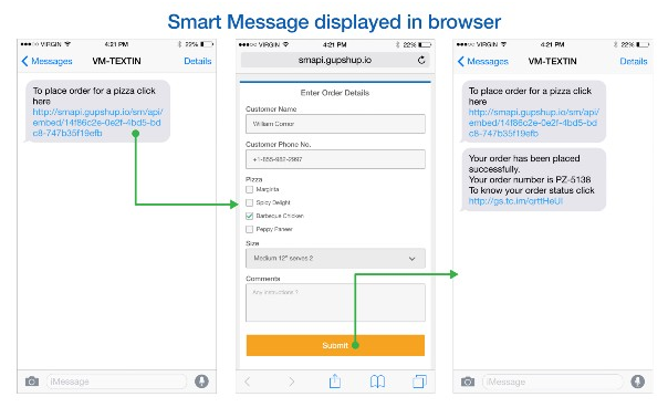
When the structured interaction requires a richer message with multiple fields, one solution is to embed a URL in the message. Clicking the link opens the structured form in a browser. This forces an end user to come out of the messaging interface but unfortunately that’s the best you can do with plain text messaging platforms.
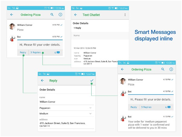
Some platforms allow in-line display of structured messages (e.g., Teamchat). And structured messages displayed in-line make it easy for the user to respond, often with a single click, while staying within the app itself. It also makes it easier for the developer to build better bots since all user input is precise and structured. I expect that messaging apps will gradually add more support for these “smart messaging” capabilities, which will be a critical prerequisite to enable more advanced workflows and bots.
So, how does the designer measure the effectiveness of a conversational flow? Just as in traditional UX design, a good place to start is by comparing the effort required by the user (input) to accomplish a certain goal (output). This gives a measure of the “efficiency” of the conversation. For a given goal (such as ordering pizza), the more efficient conversational interface is the one that requires the fewest clicks, words, responses or iterations. Maybe the most efficient pizza-ordering conversation is simply “the usual” since the bot knows everything else from prior history.
And how does the designer debug the conversational flow? Drop-offs, abandoned conversations, delayed responses, extra iterations, re-dos, are all indicative of errors in the flow. Tracking these metrics is key.
Conversational bots do not necessarily mean these bots must be engaged in human-quality conversations. So long as they can do a few things and do them well, they will be fine. Bots should not overpromise and under deliver. So long as its capability matches the expectation set with the user, the experience will be great.
As this space evolves, conversational interface design will become a lot more analytical than it is today. As more developers build bots and share best practices, we will better understand rules and techniques of conversational interface design. Happy bot building! Please share your experiences, too.
